

Hey guys ,I'm Akash Pugal from India.In this blog we are going to see how to draw beautifull line charts in python using the most popular libraries called "MATPLOTLIB" and "SEABORN".
What is a Line chart?
A line chart is a type of graphical representation which displays information as a series of data points or markers which is connected by a straight line.
For drawing a line chart using python there are two most important libraries.They are,
→MATPLOTLIB
→SEABORN
INDEX:
MATPLOTLIB-Single data
MATPLOTLIB-Multiple data
MATPLOTLIB-Customisation
SEABORN
MATPLOTLIB:
We can import the MATPLOTLIB library into our interpreter using the following piece of code,
import matplotlib.pyplot as plt
→MATPLOTLIB-Single data
Lets take a sample data for plotting(drawing) a line chart.
data=[1,1.5,1.7,4,5]
data2=[10,9,7.2,6.8,4.5]
years=[2005,2006,2007,2008,2009]
The method we use to draw line chart in MATPLOTLIB library is called “plot”.Using this method we can plot a single data(x) as well as double datas(x,y).
plt.plot(data)
The above code will draw plot the given values in the parameter variable.This will look like
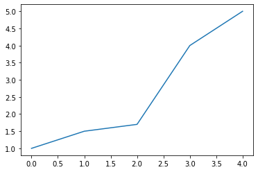
Plotting single data
But in most of the scenarios, we need to plot two values such as x and y on the same chart accordingly.This can be done just by adding another variable into the method as its second parameter.By default the system will plot the first parameter data as its x axis value and the second variable as its corresponding y axis value.
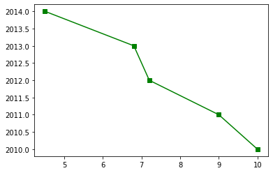
plt.plot(data,years)
After giving these two parameters into the method the graph will look like,
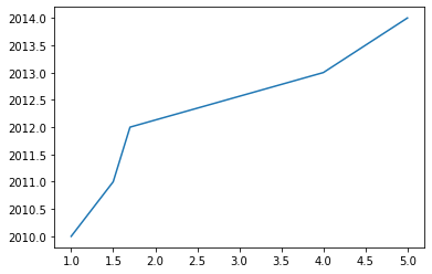
Plotting x and y axis data
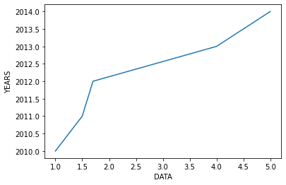
Now our chart looks nice but it is not that much understandable for a third person who is seeing it for the first time,So for a better understanding of the user we can actually set names for displaying on each axis.This can be done using the method called “label”.
plt.xlabel('DATA')
plt.ylabel('YEARS')
This will give names for each axis and display it to the user.This names will be visible to users in each graph at their corresponding axis like,
→MATPLOTLIB-Multiple data
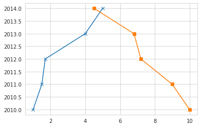
As same as drawing a single line in a graph , we can also plot more than one line in a same graph just by declaring the line values one by one such as,
plt.plot(data,years)
plt.plot(data2,years)
plt.xlabel('DATAS')
plt.ylabel('YEARS')
This will give the output like
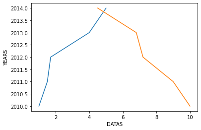
These kinds of charts will be usefull in situations where we need to see the trends of two or more data in a single graph to compare them and find the similarities or connections between them.
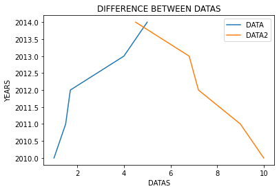
Now our chart looks good,we can also add some more information on the graph for a better user understanding.We can give a name for the chart using the “title” method and also we can show what does that each line refers.
plt.plot(data,years)
plt.plot(data2,years)
plt.xlabel('DATAS')
plt.ylabel('YEARS')
plt.title('DIFFERENCE BETWEEN DATAS')
plt.legend(['DATA','DATA2'])
The output will look like
→MATPLOTLIB-Customisation
Like this,we also have various customisations to the plot.For example we can set the marker style using the “marker” parameter like,
plt.plot(data,years,marker='x')
plt.plot(data2,years,marker='s')
This first line will set the marker style to ‘x’ and the second line sets the marker style to ‘square’.
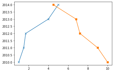
There are various markers available in MATPLOTLIB like these two.
Like the “marker” parameter we also have various styles that can be used for styling the lines and markers.Some of them are given below,
linestyle/ls    //choose between solid or dashed line
linewidth/lw    //set the width of the line
markersize/ms   //set the size of the marker
markeredgecolor/mec  //set the edge color of the marker
markeredgewidth/mew  //set the edge width of the marker
color/c        //set the color of the line
alpha          //set the opacity of the plot
...
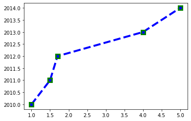
More than one parameter can be used to draw a plot like,
plt.plot(data,years,marker='s',c='b',ls='--',lw=4,ms=8,mew=3,mec='green'
The output for the above code will looks like
There is a way of declaring some styles in shorthand called “fmt”.This can be usefull in such time , if we did not need all customisations but only three parameters such a the style of the marker,style of the line,color of the line.Instead of declaring these three in three different parameters we can just specify the values for these three parameters as a single parameter and that will give the same output.
plt.plot(data2,years,marker='s',ls='-',color='green')

Instaed of writing like like,we can just declare thoseparameter like

plt.plot(data2,years,'s-g')
This will also producs the same output.
The output for the above code will looks like,
The main thing we have to remember is that, we can only specify these three parameters in this shorthand way called “fmt” and also these three values must be ordered in the same way as given.But if we did not need any one of the arguments like line style we can just specify the other two in this same order.Such as
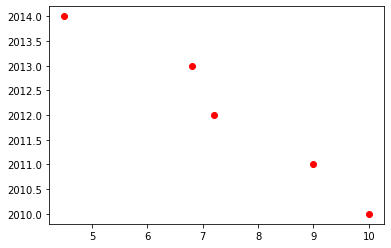
plt.plot(data2,years,'or')
The above code will specify the marker in ‘o’ shape in the color of ‘red’.But since we did not give the style of the line it just markers the pointers and did not draw the line between the marked points.The output might looks like
There is also another important method called “figure” in MATPLOTLIB.This is used to set the size of the output plot.This can be used like
plt.figure(figsize=(10,5))
plt.plot(data2,years)
As shown in the above code this line must be defined before any other lines of the plot.This takes two values a the parameter,the first one is the size of x axis and the second one is the size of y axis.
SEABORN:
Like MATPLOTLIB there is another great library in Python called ‘SEABORN”.Seaborn helps us to improve the look of the chart.Seaborn can be used with Matplotlib to get a better visualization of the graph.This can be imported like
import seaborn as sns
There is a method in seaborn which is mostly used by all visualization engineers.That is “set_style” this changes the style of the overall graph like
sns.set_style("whitegrid")
plt.plot(data,years,marker='x')
plt.plot(data2,years,marker='s')
This will give the output like,
The set_style parameter just sets the style of the overall graph.As you may noticed after using the seaborn library even the colors in the graph looks a little bit more vibrant and nice that he default color provided by MATPLOTLIB.
We only have to use the “set_style” command once,then all the graphs after that will be changed to that style.Like the “whitegrid” style we have various styles.
If we need to change the settings for the graph,we can use “matplotlib.rcParams” function like,
matplotlib.rcParams['font.size']=15
This has various methods like this.
In the next blog we are going to see how to draw "Scatter plots" using Python.